Two products built from scratch for personal shoppers: Hero Mobile for field use, Hero Desktop for management. Test coverage established from the first commit — quality as part of the workflow, not a final step.
DesignMySide

01
Overview
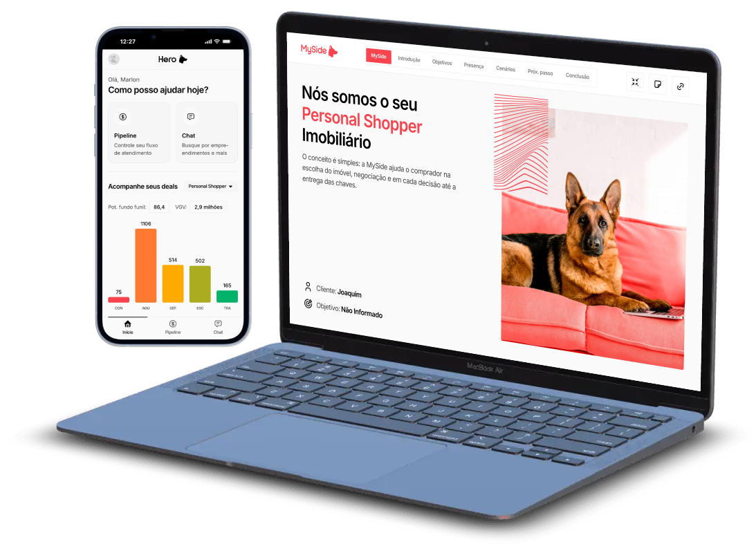
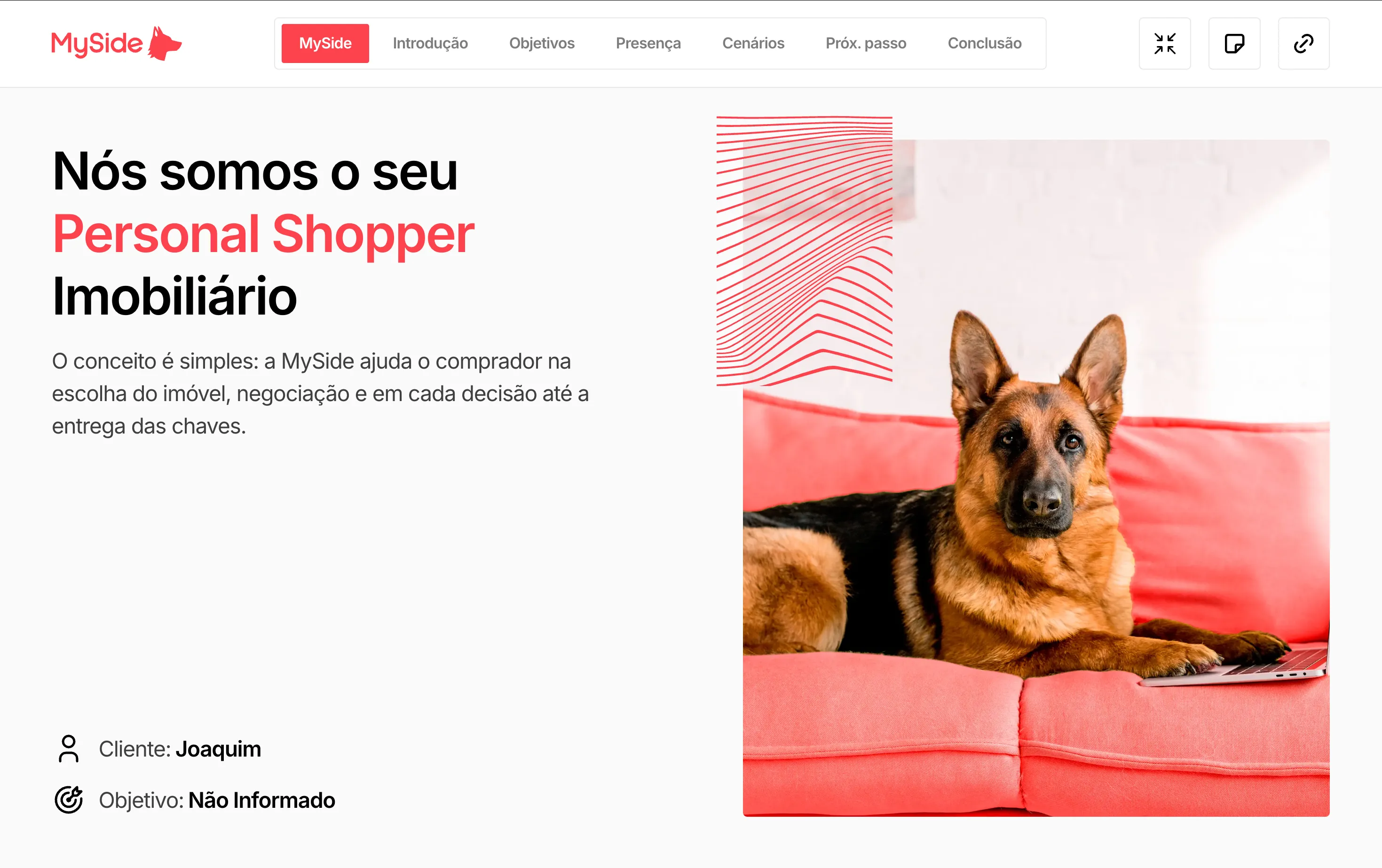
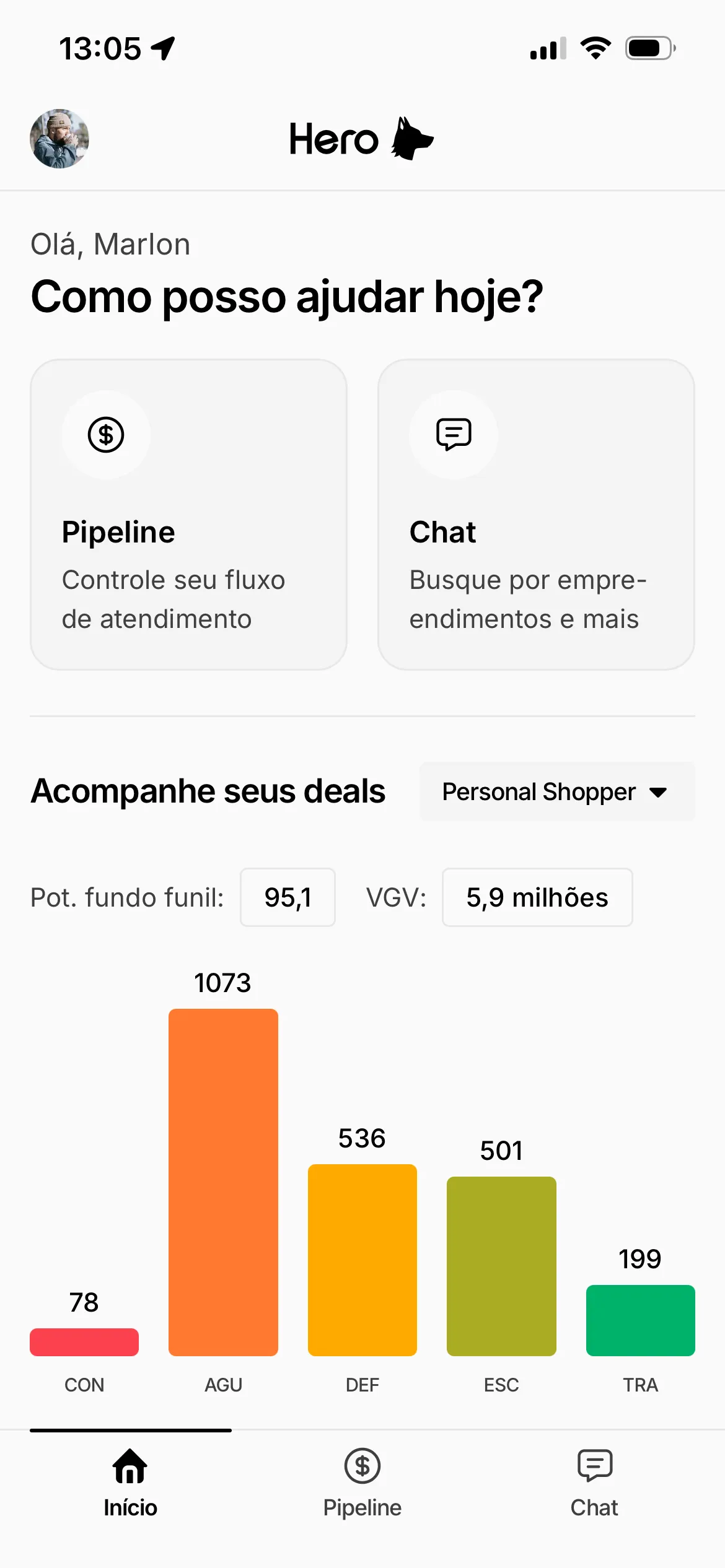
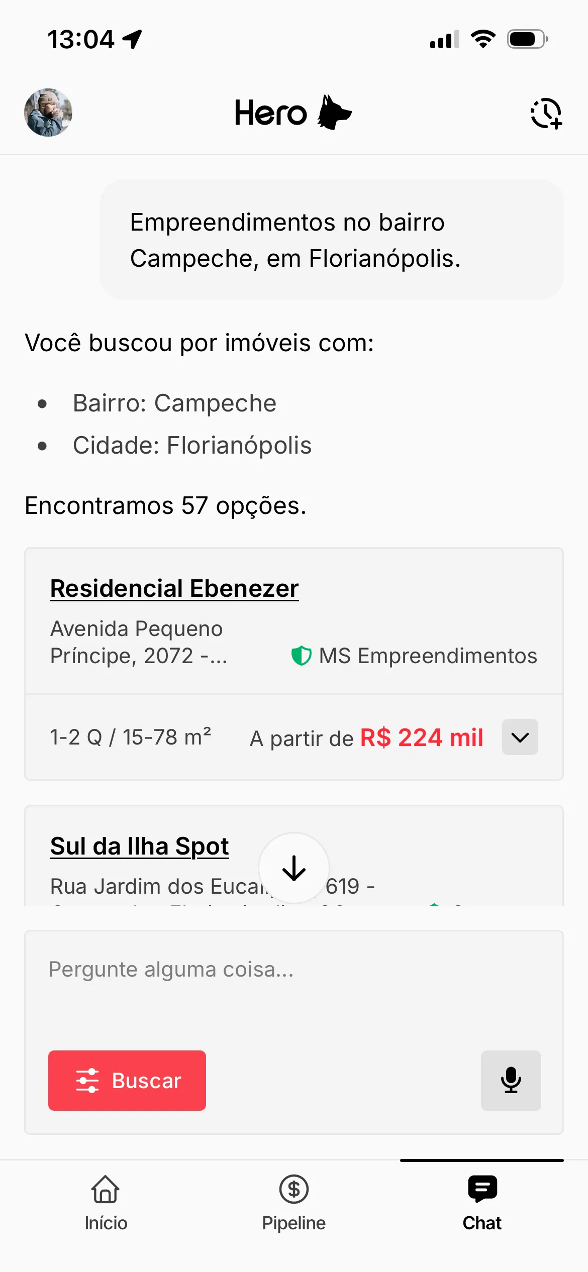
Hero is a platform developed at MySide to support the personal shopper workflow. The project was split into two products: Hero Mobile, a PWA built for field use, and Hero Desktop, designed for management and operations on larger screens. Both needed to work independently while maintaining visual and functional coherence between them.
Both products needed to operate independently without losing visual and functional coherence. Automated tests with Jest and React Testing Library were integrated from the start of development — coverage as part of the workflow, not a later step.
02
Challenge
Building two distinct products from scratch required early architectural decisions: what would be shared across platforms and what would need independent implementations. A poorly calibrated separation would lead to unnecessary coupling or code duplication with no real benefit.
The PWA needed near-native behavior in field conditions — unstable connections, smooth transitions, reliable loading. That made performance and caching strategy real constraints from the first sprint, not post-launch optimizations.
Establishing testing standards from the first commit was a deliberate decision: making coverage part of the workflow rather than a final step required team discipline throughout the product's growth.
03
Solution
Hero Mobile and Hero Desktop were separated into independent experiences, with shared components only where genuine reuse made sense — the distinction was made case by case, not as a blanket rule.
The PWA was implemented with service workers and caching strategies that ensured a reliable experience even on degraded connections. A mobile-first design informed every layout decision in the field product.
The testing structure with Jest and React Testing Library was established at the project's outset, making coverage a part of the development workflow and making future expansion of the product safer over time.